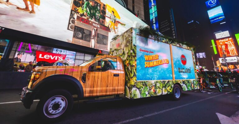
Why Outdoor Brand Activation Displays Draw a Crowd

By: David Botbol 9 min read

Why Outdoor Brand Activation Displays Draw a Crowd

Brand activation displays are the part of a build that does the selling, and they are usually designed last.

The wrap gets rounds of revisions because it is what everyone sees in the renderings. The display, meaning the shelving, the product wall, the counter, and the lighting, is what a customer actually looks at once they have stopped, and it decides whether they engage or drift off.

This guide covers what a display has to do, how to design one, and what changes when the whole thing is outdoors.

Key Takeaways

  • The display sells, the wrap attracts: the wrap earns the stop and the display converts it, so they are different jobs.
  • Design at eye level: the shelf someone looks at without moving their head is the most valuable surface in the build.
  • Lighting is not decoration: an unlit display disappears after dusk and photographs badly in daylight shade.
  • Outdoor changes everything: sun, wind, rain, and overnight security are design constraints rather than operational afterthoughts.
  • Leave nowhere to hide: stock, cables, and bins are visible unless storage is designed in, particularly in a glass build.

What Is a Brand Activation Display?

A brand activation display is the built environment a customer engages with once they reach the activation: product walls and shelving, counters and service points, signage and menu boards, props, and the lighting that makes all of it legible.

It is distinct from the vehicle wrap, which is exterior and works at distance. The display works at arm’s length, and the two need to be designed together rather than sequentially. Our guide to experiential marketing capabilities covers where fabrication sits in the process.

What a Display Has to Do

  • Show the product clearly, since a range that cannot be taken in at a glance will not be browsed.
  • Direct movement, guiding someone from arrival through interaction to the takeaway without anyone explaining it.
  • Hold attention long enough for a conversation, which is the entire purpose of staffing the activation.
  • Photograph well, because the display is the backdrop in most of the images people take.
  • Conceal everything else, meaning stock, cabling, waste, and staff belongings.

How to Design an Outdoor Brand Activation Display

Here are the steps to follow o design an eye-catching brand activation display. 

1. Start From the Customer Journey

Map what someone does from the moment they arrive: what they see first, where they queue, where they interact, and where they leave. The display should make that sequence obvious without signage explaining it, because people will not read instructions on a street.

2. Put the Hero Product at Eye Level

The shelf at roughly 1.4 to 1.6 metres is the most valuable surface in the build, since it is what someone sees without moving their head. Secondary product goes above and below. This is standard retail practice and it is regularly ignored in activation builds.

3. Design the Range to Be Read at a Glance

A product wall works when someone can take in the full range in a couple of seconds. Grouping by shade, flavor, or use case does that. A grid of near-identical packaging does not, however visually satisfying it looks in a rendering.

4. Light It Deliberately

Lighting is the element most often left until the build is finished, and it is the one that decides whether the display is visible at all after 4pm in winter. Front-facing light on the product, nothing pointed at customers’ eyes, and enough output to compete with street lighting.

5. Build the Storage In

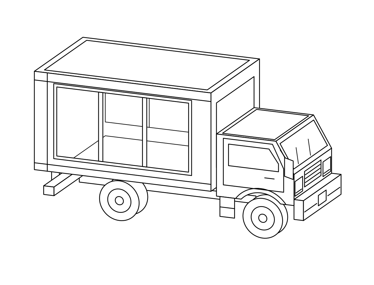
Every activation has stock, cabling, waste, and staff bags. If storage is not designed in, all of it ends up visible. This matters most in a glass box truck, where there is genuinely nowhere to put anything out of sight.

6. Check the Frame

Photograph the rendering and ask whether the brand is legible in the shot. If the display only reads to someone standing directly in front of it, it will not carry in the images people post.

Case Study: How a Display Wall Did the Selling for Rose Inc

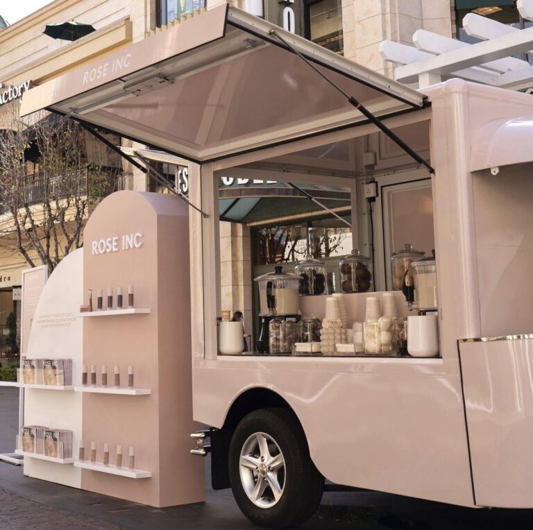
Rose Inc. pink mobile pop-up booth with beauty products on display, set up near upscale shops.

Rose Inc toured Los Angeles, New York, and London to introduce a micro-encapsulated makeup collection, which is a difficult proposition to explain quickly on a street.

We built a product display wall into the activation so guests could take in the full range at a glance while they queued, rather than having it described to them. The queue itself became the browsing time. Guests received a complimentary hot cocoa customized to represent the range of skin tones the makeup is made for, along with an exclusive gift from Space NK and Sephora.

Why the display was the campaign: for a color cosmetics brand the range is the product, and a wall that showed all of it converted waiting time into consideration. Nobody had to explain the collection, because people had already looked at it. Read the full activation in our Rose Inc case study, or browse more brand activation case studies.

What Changes for an Outdoor Brand Activation

An outdoor build faces conditions an indoor one never does, and each is a design decision rather than an operational one.

  • Sun. Direct sunlight fades packaging, melts product, and makes screens unreadable. Orient the display away from the afternoon sun or shade it.
  • Wind. Signage, banners, and lightweight props become hazards. Anything vertical needs weighting or fixing, and permits often require it.
  • Rain. Cardboard, paper collateral, and unsealed timber degrade quickly. Specify materials that survive a wet afternoon.
  • Heat and cold. Product tolerances matter. Chocolate, cosmetics, and anything with an emulsion behave differently at 32 degrees.
  • Light levels. Daylight washes out screens and shaded corners photograph badly. Lighting has to work across the whole day.
  • Overnight security. A display holding merchandise needs a plan for the hours when nobody is there.
  • Ground conditions. Kerbs, camber, and uneven paving affect whether a build stands level and safely.

Common Mistakes

  • Designing the display after the wrap. They work together and should be designed together.
  • Over-filling the shelves. A dense wall of product reads as a warehouse rather than a selection.
  • Forgetting the queue’s sightline. People spend more time looking at the build from the queue than from the counter.
  • No lighting plan. The single most common omission, and the one that ends the day early in winter. For more on how a display supports the wider build, see our guide to brand activation ideas and our roundup of brand activation examples.
  • Materials chosen for renderings rather than for weather. A finish that photographs beautifully and warps in rain is a bad choice.

How to Measure Whether the Display Worked

  • Dwell time at the display, which is what the build exists to extend.
  • Products handled or sampled, showing whether the range invited engagement.
  • Questions asked about specific products, indicating what the display communicated and what it did not.
  • Tagged photos featuring the display, the test of whether it worked as a backdrop.
  • Conversion at the point of interaction, since a good display should lift it against a plain counter.

The Bottom Line

Brand activation displays are where the campaign converts. The wrap gets people to stop, and the display decides what happens next: whether they browse, understand the range, stay long enough to talk, and take a photograph worth posting.

Outdoors, every one of those decisions has to survive sun, wind, rain, and the hours when nobody is watching the build. That is a fabrication problem, which is why it belongs in the design rather than in the setup.

We design and build displays in house alongside the vehicles they sit in. Explore our brand activation services or contact our team.

Frequently Asked Questions​

A brand activation display is the built environment a customer engages with at an activation: product walls and shelving, counters and service points, signage and menu boards, props, and lighting. It works at arm’s length, unlike the vehicle wrap which works at distance.

At eye level, roughly 1.4 to 1.6 metres, since that is what someone sees without moving their head. Secondary product goes above and below. This is standard retail practice and it is routinely overlooked in activation builds.

Because an unlit display disappears after dark and photographs poorly in daylight shade. Lighting should be front-facing on the product, avoid pointing at customers’ eyes, and produce enough output to compete with street lighting.

Sun fades and melts product and washes out screens, wind turns signage into a hazard, rain degrades paper and unsealed materials, temperature affects product tolerances, and merchandise needs overnight security. All are design decisions, not operational ones.

Design storage into the build. Every activation has stock, cabling, waste, and staff belongings, and if there is no concealed place for them they end up on show. This matters most in glass builds, where nothing can be hidden after the fact.

Enough that the range can be taken in at a glance, grouped by shade, flavor, or use case. Over-filled shelves read as a warehouse rather than a selection, and a dense grid of near-identical packaging communicates very little.

Considerably, since it is the backdrop in most images taken at the activation. Photograph the rendering and check whether the brand is legible in the frame. If it only reads head-on, it will not carry in the images people post.

Anything that survives sun, rain, and handling. Cardboard, uncoated paper, and unsealed timber degrade quickly outdoors. Specify for a wet afternoon rather than for how the finish looks in a rendering.

Track dwell time at the display, products handled or sampled, questions asked about specific items, tagged photographs featuring the build, and conversion at the point of interaction compared against a plain counter.

The wrap is exterior and earns the stop from across a street. The display is interior and converts that stop into browsing, conversation, and a photograph. They do different jobs and should be designed together rather than one after the other.

FTP Free download

The Mobile Pop-Up Shop Launch Checklist

7 steps, 37 checkpoints, and a one-page brief to plan and launch a mobile pop-up shop that converts.

Instant PDF · No Cost

David Botbol

Author

David Botbol

EVP, Managing Director @ FTP Agency

David Botbol thrives on turning bold ideas into real-world brand moments. As Executive VP and Managing Director of Food Truck Promotions, and a leader within the New York and Los Angeles Food Truck Associations, he draws on a background in business development and startups to help brands connect with audiences through creative, unforgettable mobile experiences.

More posts
Top 12 Brand Activation Ideas That Grab Attention